Why make the user do the work when you already have the information you need to make it feel like magic?
Something I think about a lot with UX is trying to minimize work for the user. Why? For starters, people are inherently lazy. (As my students know, I call this The Laziness Principle™*)
But even more fundamentally, any time the user thinks they will have to do work, and then they learn that we've already done it for them– that's an opportunity to exceed their expectation and create a moment of surprise/joy/delight/glee i.e. all the good emotions we want to elicit from our users.
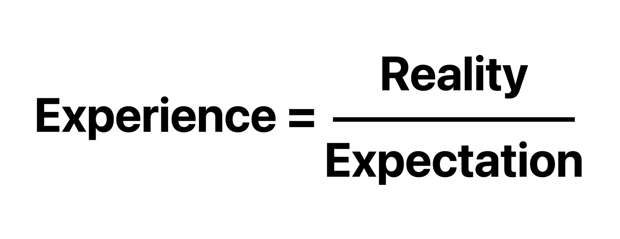
Any time we have the ability to overdeliver, that is at the core of designing a better UX. I've coined this as The Experience Formula™ – a simple, but incredibly powerful way to understand the abstract and subjective concept of experience.

If you match the user's expectation 1/1, then they will have the experience they thought they were going to have.
If you deliver below their expectation <1/1, it will be a worse experience.
If you deliver above their expectation >1/1, it will be a better experience.
Understanding the user's expectations is the key of course; otherwise you are just aiming blind. One way to do that is to ask the user. Doing this kind of kills the vibe though– imagine asking your husband or wife, "What do you want for your birthday?" And then getting exactly that. Not the stuff that romance is made of.
The other way sneakier and better way is to infer what the user is expecting and what they need from the information you already have on hand, or by getting that information in a less obvious way.
A classic example of this is the zip code auto-filling in an address form. If we already have your street address, city, and state, then we can easily fill in the zip code. But until we do, the user is expecting that they will need to do it themselves since they start with a blank form. Then right before they get to that field... boom! Zip code magically appears. Amazing feeling.
Counterintuitively, if you had a label in advance that said "Zip code will auto-populate" that would actually make for a worse experience. It being a pleasant surprise is an important part of what makes it so satisfying.
Anyway, what made me think of all of this was something that just happened on my phone this morning when I put in my AirPods.
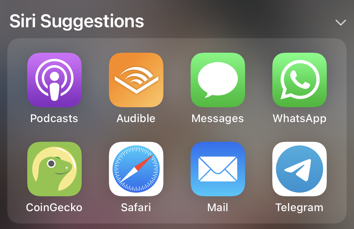
Here is a screenshot of my Siri Suggestions when first opening my phone at 9:28am. A random smattering of commonly used apps. This is my baseline.

Side note: My Mail app has zero accounts connected to it as I wrote about here, so displaying it is actually the opposite of the lesson I'm trying to demonstrate here. My phone knows that I have no email, so why is it still showing it to me?
Then, I put in my AirPods. I didn't do anything else– didn't open any apps, the only change was connecting AirPods.

Opening Siri Suggestions after, you will notice a difference.

My two most commonly used audio apps have jumped to the first two slots.
Wow! Is this Apple's multi-billion dollar AI at work? Isn't Siri powered by machine learning?!
No. It's much simpler than that. If AirPods are connected, then bump audio apps to the front of the line. If not, not. Beautiful UX that anticipates my next move. Feels like magic.
How could it be improved even further?
- I would throw the phone app in there, Zoom– any app that uses audio. A slightly fancier version would be any app that I personally have used with AirPods in the past, listed either in order of most used or most recently used, and you could scope that to date/time, like ranking by most used on weekday mornings.
- Make it more consistent– sometimes meeting expectations 1:1 is exactly what the user needs. Once I've seen this a few times, it would be nice to anticipate the placement of the various audio apps. Pop in my AirPods and tap on the second slot to get Audible, every time.
- Push not pull– I still need to go to the search to access these Siri Suggestions. They also could be added to my home screen as a widget. However, a push notification when I connect AirPods would be even less work. There are hints of this as sometimes I see pertinent Siri Suggestions on the lock screen, but again, it's not consistent.
In conclusion: Use the data you have to infer what the user wants to do and what they were prepared to do themselves, and then do it for them!
*No, I didn't actually trademark this, because... I'm lazy!


